Clear Digital is a founding member of Myrious Group's expertise-driven agencies.
Myrious Group is an independent holding company enabling forward-thinking brands to achieve breakthrough performance through power of orchestration.
Visit Myrious.com

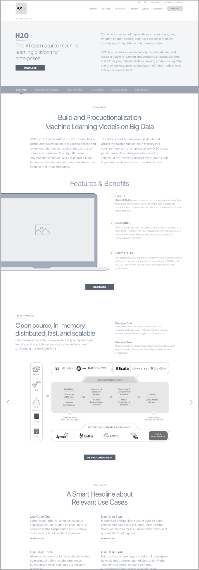
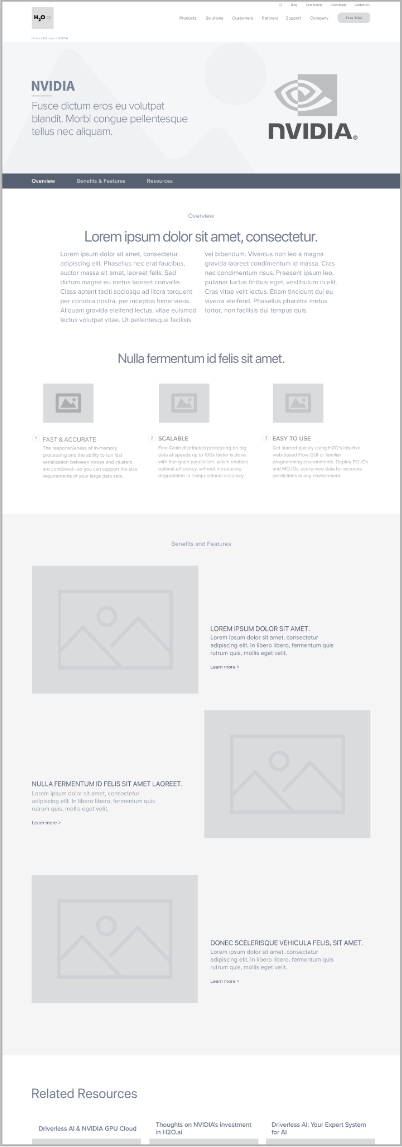
When leading artificial intelligence firm H2O.ai needed to revamp its brand, Clear Digital took the brand and the experience to a whole new level. H2O.ai’s open-source engine is used by over 18,000 organizations globally. As a company known for its impeccable service, H20.ai needed a web experience that aligned with its position and approach. By taking inspiration from the company’s existing assets and developing a disciplined digital style guide, we created an ownable website experience that even won an Addy award for cross-platform branding.
"We worked closely with the management team at H2O.ai to define their brand, see what elements were working for them, and what could be improved or redesigned. Once we had alignment on the direction, we applied the new brand to the H2O.ai website and collateral."Danny Halvorson Creative Director
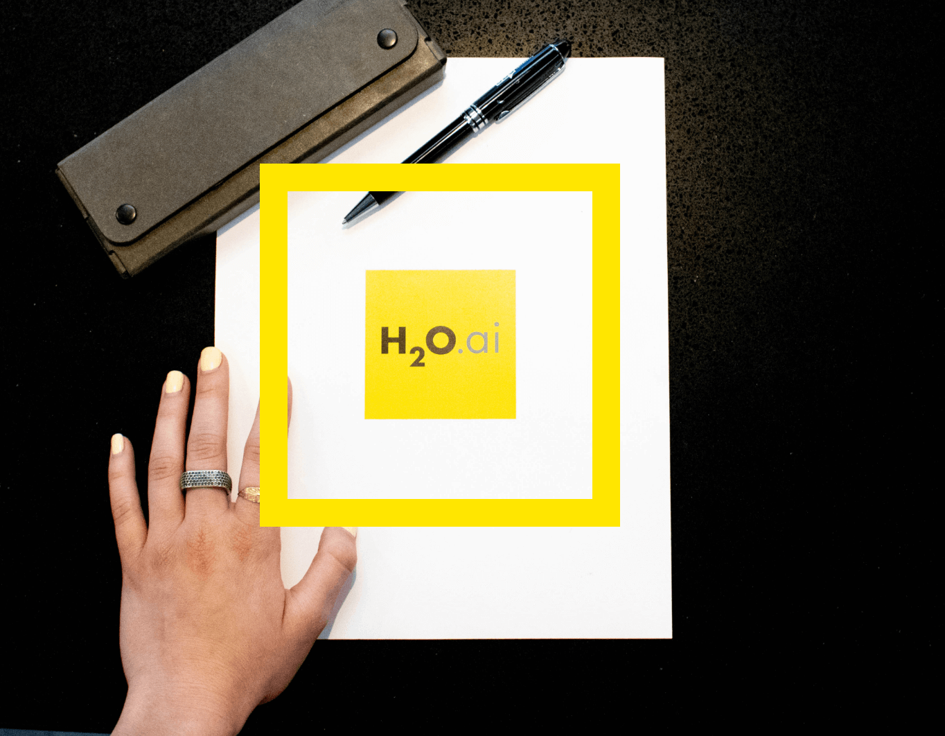
The previous H2O.ai logo followed a loose framework with a black and yellow palette but was inconsistently applied across different assets. While we kept the general approach of the logo, we grounded it within a structured yellow square so that it could be ownable and repeatable. We also permanently included “.ai” within the box and refined the typography to communicate the brand in a more legible and elegant way.
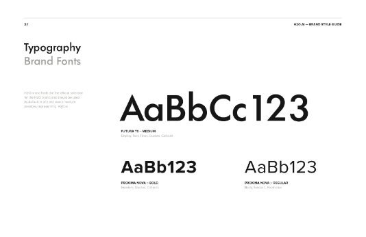
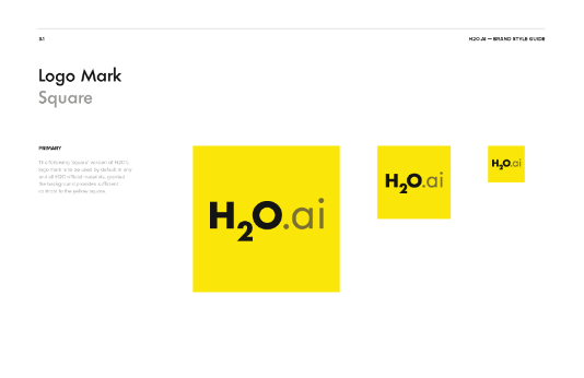
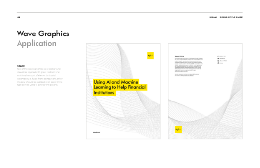
When Clear Digital began the project, H2O.ai was by no means a startup anymore. The company had done extensive marketing and promotion which left them with a variety of visual directions that weren’t unified. They had multiple colors, fonts, and sets of iconography that were campaign driven, which left them without an underlying brand strategy.
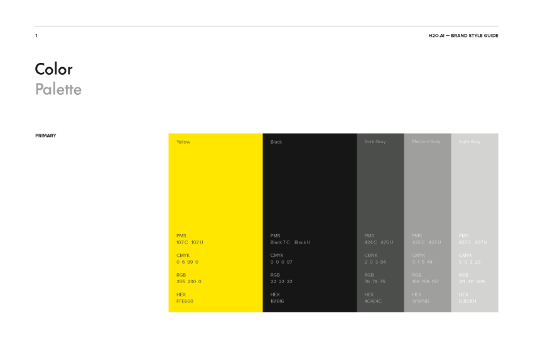
By creating clear rules through a style guide before we began designing the site, we were able to tease out the best elements and harmonize how different components would work together. We selected a typography that was reflected in the logo and officially defined black and yellow as the color palette. For iconography, we used the black and yellow palette and a simple line style. The company had also previously made use of a wave pattern, inspired by a piece of art in the CEO’s office. As this was an interesting and personal element, we folded it into the brand identity, creating an art file with a standardized version of the waves.
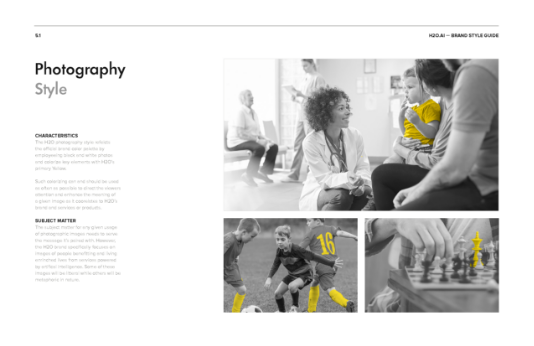
For many companies ensuring brand recognizability beyond the home page can be challenging. Given H20.ai’s unique color palette, the Clear Digital design team saw an opportunity to create a highly ownable photographic style that would ensure that every page felt distinctively like them. Whether using slice-of-life or metaphorical stock photography, all photos are black and white with a pop of H20.ai’s signature yellow. These bold photos with yellow accents complimented the typography and set the tone of the website.

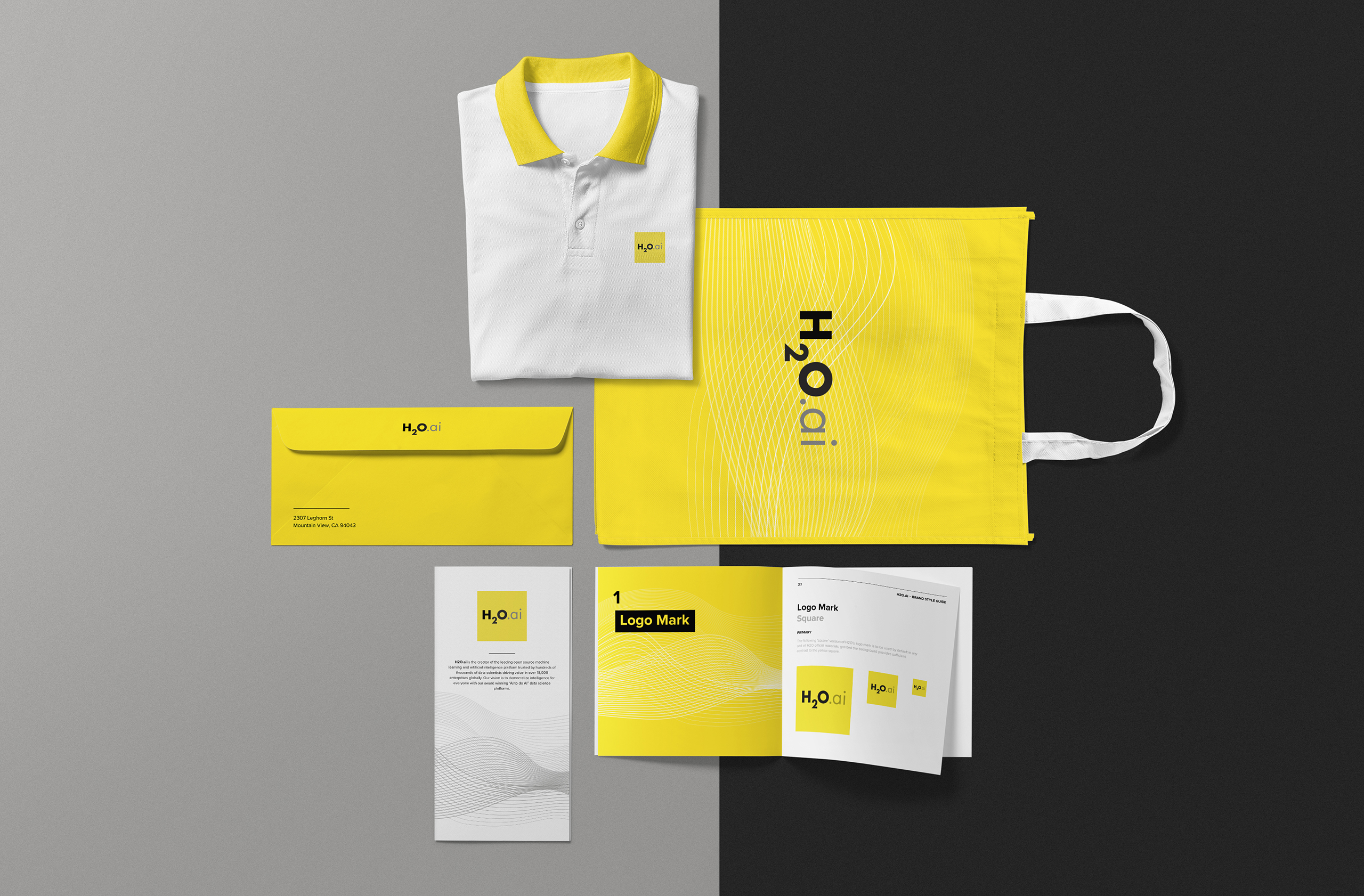

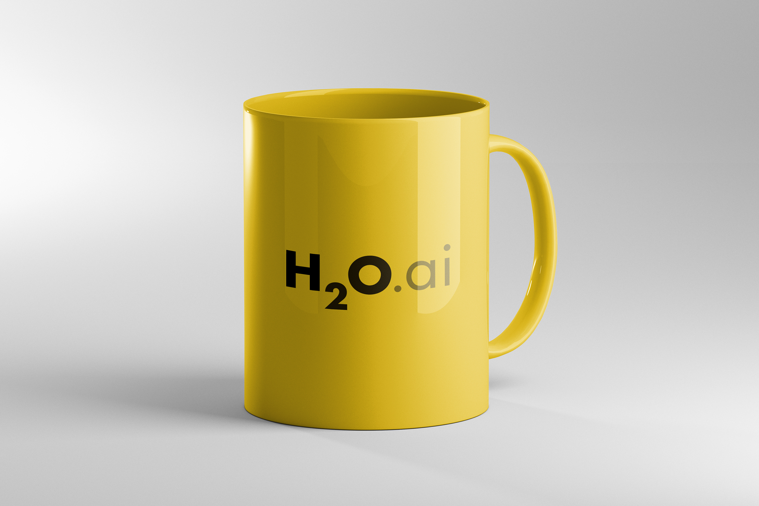
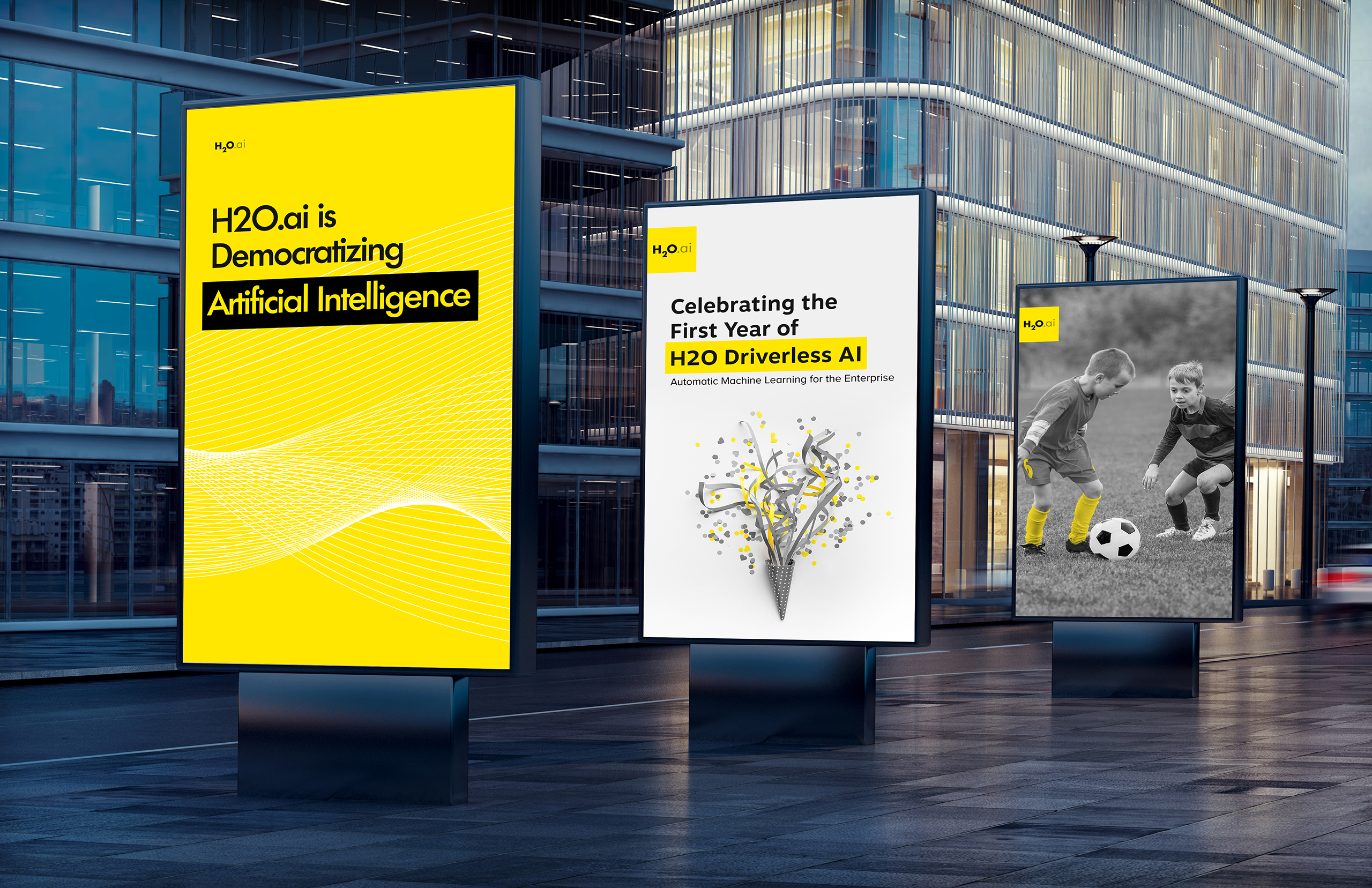
By starting with a digital rebrand, we could easily translate the style guide into the website, powerpoints, and collateral, as well as real world applications like t-shirts, bags, and paper goods. We used Wordpress for the site so that we had plenty of flexibility to implement the brand elements in a natural flow. The black and yellow palette within the photography, text, and backgrounds, as well as the defined logo and typography, grounded the look and feel of the website and made all of the assets highly ownable.
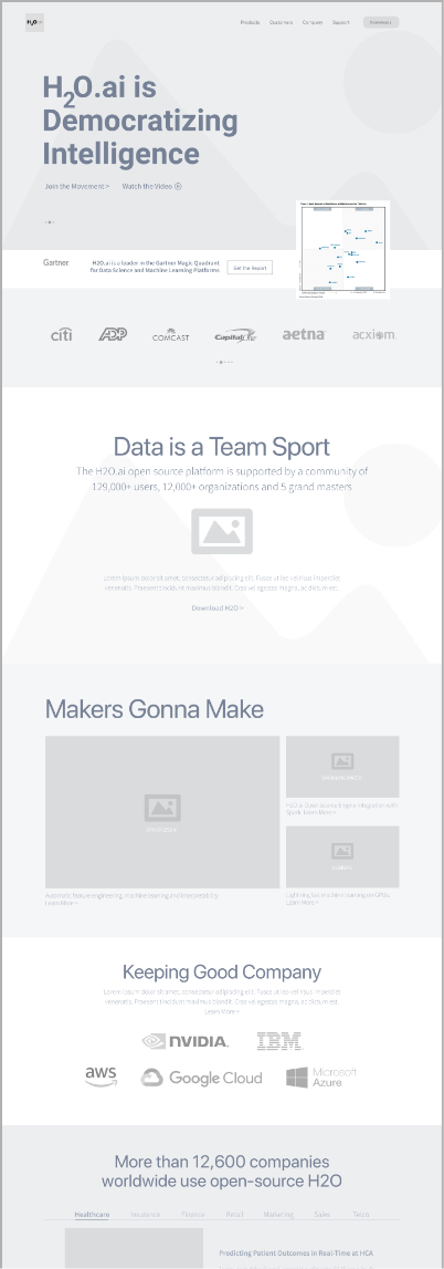
Our initial research into H2O.ai uncovered that while the company wasn’t a highly recognizable brand, it had significant credibility that wasn’t being highlighted. Gartner had named the company the leader in the 2018 Magic Quadrant, but this wasn’t presented online as a leading message. We put this insight to work to define the home page, including it above the fold and making it persistent throughout.
As part of the user experience, we also leaned heavily on the CEO’s thought leadership that had high memorability in the industry. By using his catchphrases, memes, and puns as headlines, we were able to give the site a distinctive fun flavor that was wholly anchored in the company’s core value: democratizing AI for all. We restructured the home page and used an elevator pitch format to communicate who they were, what they did, and why customers needed them. By filling in the narrative blanks, we were able to elevate the brand story and educate a wider audience. We worked to balance their open source offering with the enterprise platform, as well as the needs of a business and technical customers across pages. We also created a pipeline that drew leads without being off-putting to the open source community.
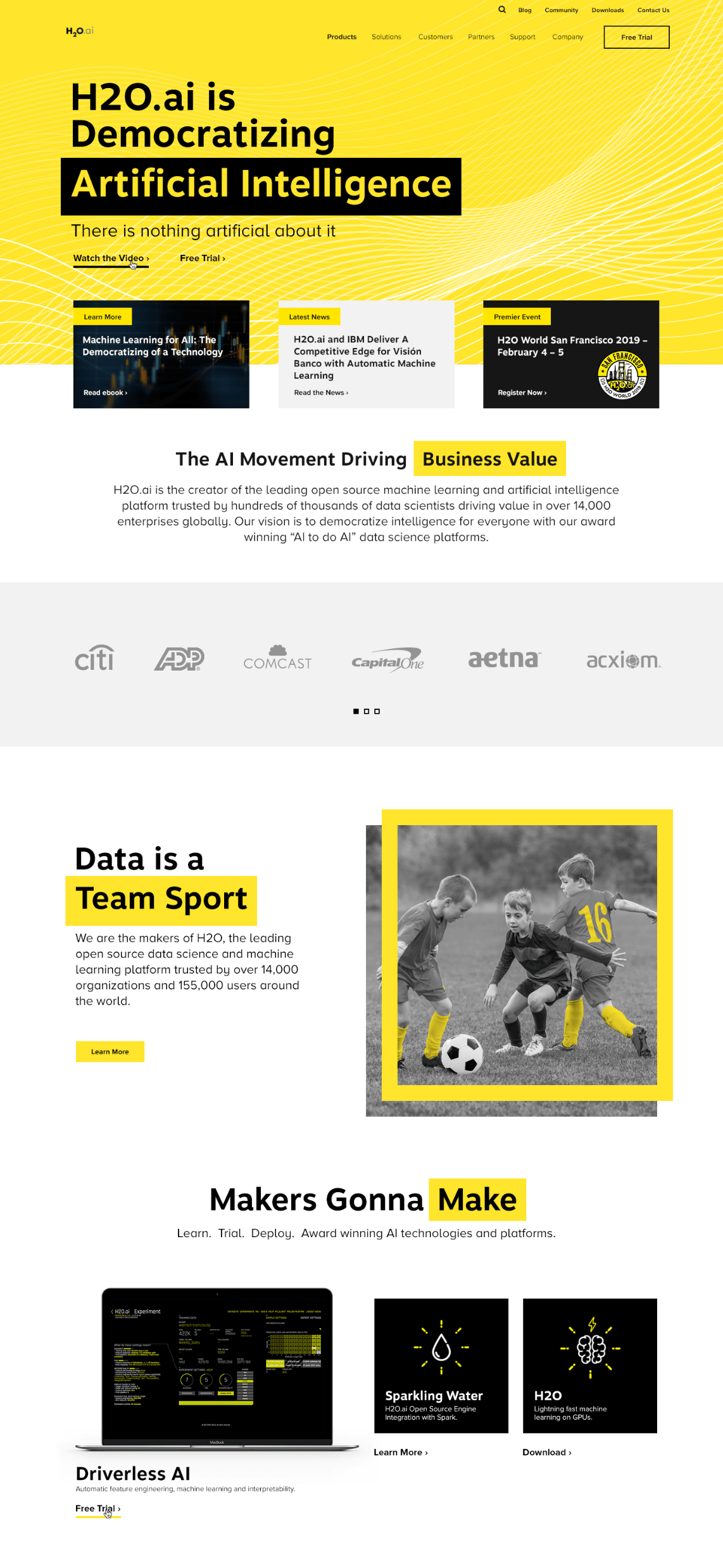
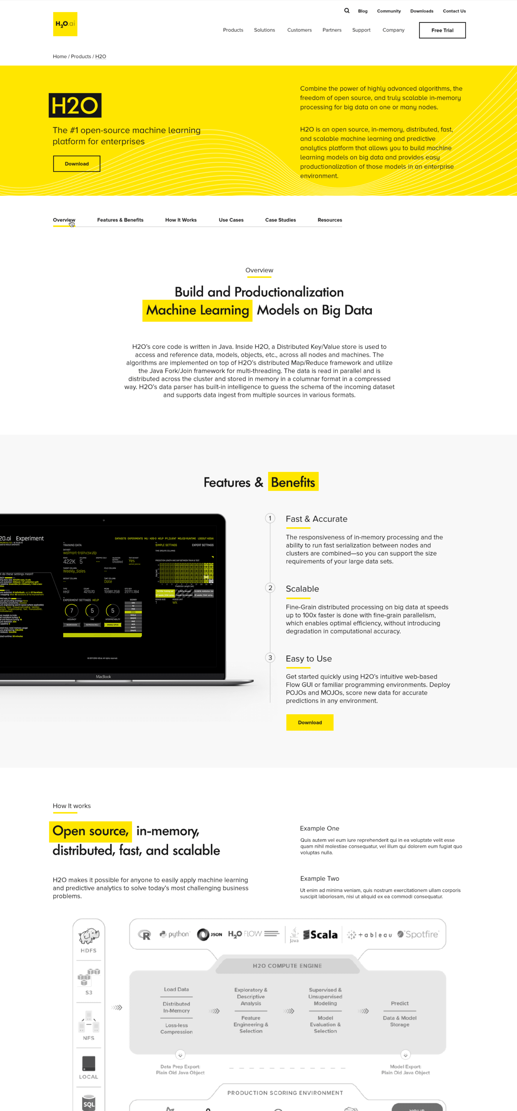
Like many of our clients, H20.ai was anxious to launch a new site quickly. To address this sense of urgency while still honoring the depth of work that a complex site requires, we proposed a staged release. The site was launched in three phases, a common approach we take with our clients now to ensure ongoing operability and the need for speed. The objective is to seamlessly roll out section to support a new look and feel, while balancing back-end realities like hosting and transition as efficiently as possible.

Specially designed to deliver rich web content without the need for additional plugins.
The latest standard for CSS and completely backwards-compatible with all earlier versions.

The powerful JavaScript Library jQuery greatly optimizes JavaScript programming.

An open source content management system, built and supported by an active global community.
Share your project details. We want to hear all about what you need.
Clear Digital is a founding member of Myrious Group's expertise-driven agencies.
Myrious Group is an independent holding company enabling forward-thinking brands to achieve breakthrough performance through power of orchestration.
Visit Myrious.com© Copyright 2024 Clear Digital, Inc., a Silicon Valley / San Jose Web Design Company. All Rights Reserved.