Clear Digital is a founding member of Myrious Group's expertise-driven agencies.
Myrious Group is an independent holding company enabling forward-thinking brands to achieve breakthrough performance through power of orchestration.
Visit Myrious.com
Riverbed is a global leader delivering digital performance solutions for today’s cloud-mobile world. When they needed to update their brand to match their innovative products and solutions, they came to Clear Digital to revamp their logo and evolve their website.
Old Logo:

New Logo:

The Clear Digital team wanted to give Riverbed’s logo a more modern feel without making it unrecognizable. We created multiple options and iterations, which let Riverbed explore all ways they could evolve their brand. They chose a new, customized font in a brighter shade of orange that feels fresh, but also familiar.

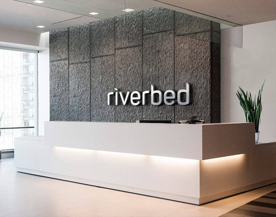
With a tight timeline for the rebrand launch, we got right to work providing varying shades in the same color palette and exploring custom lettering styles. It’s all about seeing it and knowing what works. In the end, Riverbed went for a bold new style—shown here in their corporate headquarters.
Riverbed already has a strong color scheme which they use throughout their website. Clear Digital brightened it up to give the whole site a visual lift, while maintaining consistency. Working examples of each new shade in the real world to bring the whole palette to life.
CMYK
C:36 M:26 Y:36 K:0
RGB
R:168 G:172 B:161
#A8ACA1
CMYK
C:77 M:60 Y:44 K:25
RGB
R:65 G:85 B:100
#415464
CMYK
C:69 M:43 Y:30 K:4
RGB
R:91 G:126 B:150
#5B7E96
CMYK
C:69 M:14 Y:0 K:0
RGB
R:0 G:174 B:239
#00AEEF
CMYK
C:0 M:31 Y:97 K:0
RGB
R:255 G:184 B:29
#FFB81D
CMYK
C:0 M:72 Y:100 K:0
RGB
R:255 G:107 B:0
#F36C21
Impactful

Holistic

Enable
Digital

Performance

Heritage

Panton:

Custom:


The new Riverbed logo is based on a customized font to help Riverbed stand out as a digital leader. The Clear Digital team adjusted the letter positioning to make the logo feel more expansive, and added sleek cuts to make it feel more modern. The end result is a sophisticated, balanced font that makes a statement.
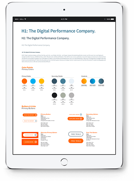
To help Riverbed maintain a consistently powerful brand going forward, we created a digital style guide that will help shape future pages and iterations on their website. Launching the new brand on the company website first played perfectly with the company’s digital-first focus.
Clear Digital replaced Riverbed’s traditional black and white icons with illustrated icons using the new color palette. The new icons are clean, simple, and add a bit of fun. To tie the imagery together across the site, we applied filters and colorization to stock imagery to add some distinction. By avoiding metaphors and aligning hues, these visuals provide a seamless feel from page to page.


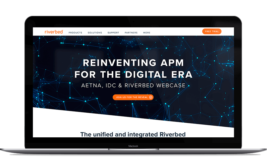
As a global leader, it’s important that Riverbed’s website be fully responsive to any device, screen, or operating system. Clear Digital also added a background video to the homepage to provide an immediate digitized interaction, and simplified the navigation by moving it to the top of the site.
Share your project details. We want to hear all about what you need.
Clear Digital is a founding member of Myrious Group's expertise-driven agencies.
Myrious Group is an independent holding company enabling forward-thinking brands to achieve breakthrough performance through power of orchestration.
Visit Myrious.com© Copyright 2024 Clear Digital, Inc., a Silicon Valley / San Jose Web Design Company. All Rights Reserved.