Managing the digital representation of your B2B firm can be reduced to a single objective: Offer every prospective or existing customer a positive experience. Your success depends on a site that delivers on its objectives at every customer touchpoint. But just as importantly, your site should offer a consistent message from your brand, which builds trust for your audience.
Responsive design enables your website to deliver a consistent impression to your users regardless of the device they’re using. However, you have to be mindful of more than how different screen sizes will impact your current website design. You need to consider how your site’s content should respond to the viewing capabilities of your user.
5 Areas of Focus for a Responsive B2B Website
Google’s emphasis on mobile-first indexing in its search algorithm has underscored the importance of ensuring your website accommodates devices such as tablets and phones. However, you need to ensure your website’s design and development team are capable of thinking bigger with your design as well.
For B2B firms, your customers are more likely to evaluate your offerings and convert from their desktop machines than their mobile devices.
With more users opting for high-definition desktop displays at 1080p or higher, your site should be capable of scaling up to support larger monitors and resolutions as well. For B2B firms, your customers are more likely to evaluate your offerings and convert from their desktop machines than their mobile devices. You have to consider all devices a strategic priority.
Following these 5 guidelines will allow your firm to provide an equitable user experience:
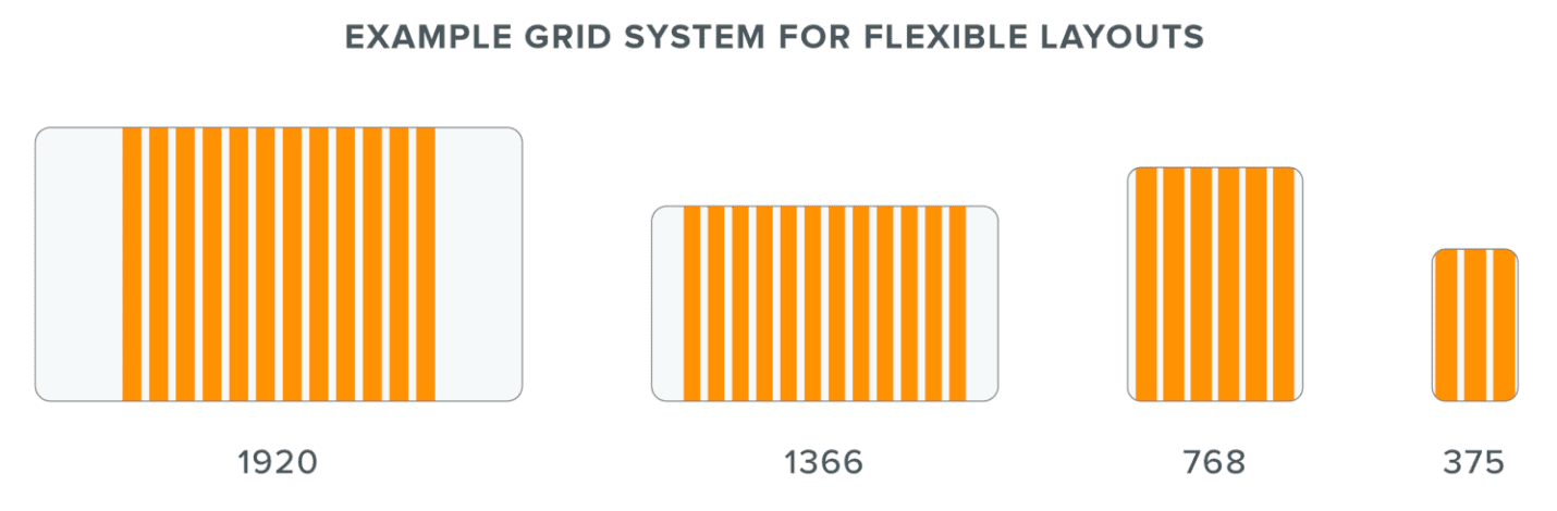
Establish Flexible Layouts and Grids
Great digital design is built on a grid, which ensures each element on a page’s layout is aligned and separated at a fixed distance. Your user’s device makes an impact on the visible area of your web page, which is referred to as a viewport. Smaller and larger screen sizes affect how your layout will display.
When your site uses a fixed layout, your design’s margins will shift until it reaches the predefined screen sizes of a tablet or mobile device. However, if your user’s browser isn’t sized to match those proportions, your design will look poorly spaced at best and broken at worst.
By contrast, a flexible layout keeps the spacing on your page consistent as your user’s screen size changes. The spacing for each device isn’t the same in terms of pixels, but your elements on the page will change in a way that’s proportional to the rest of your design. When a browser window shrinks to fit the screen size of a tablet or phone (also called a breakpoint), your design will shift to predetermined layouts that provide the best user experience.
To ensure your site accommodates different viewports in a way that protects the integrity of your design, your site should incorporate a grid with a flexible layout. Whether your user’s screen size grows bigger or smaller, your page elements will respond accordingly to display what’s important in a clear, consistent way.
Test Responsive Typography and Graphic Elements
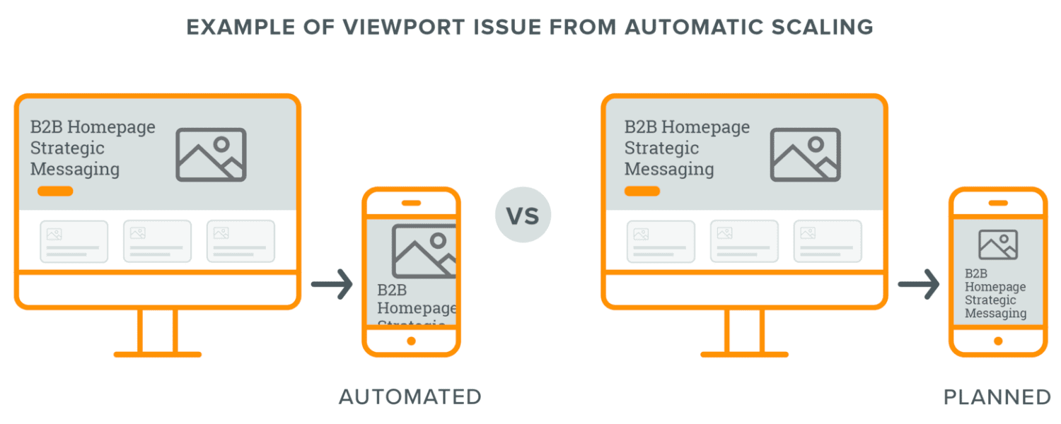
Along with establishing a flexible layout, you also need to ensure your text, images, and videos respond to your user’s viewport. However, scaling to fit a given device’s screen size isn’t enough to ensure a consistent experience.
Depending on the size or orientation of a graphic element, a responsive design could easily crop out an important part of the image on mobile. Fonts might scale to an unreadable size as your design scales, or your text may be too large for a mobile layout.
As your mobile site is developed, each element on your site should scale in a way that suits your design. For example, if your website features a horizontal header when accessed on a desktop machine, your developers should ensure the image orientation switches to vertical once a user’s screen size changes to a mobile device. Flexible, adaptable website content planned by your designers and programmed by developers is key to a consistent user experience.
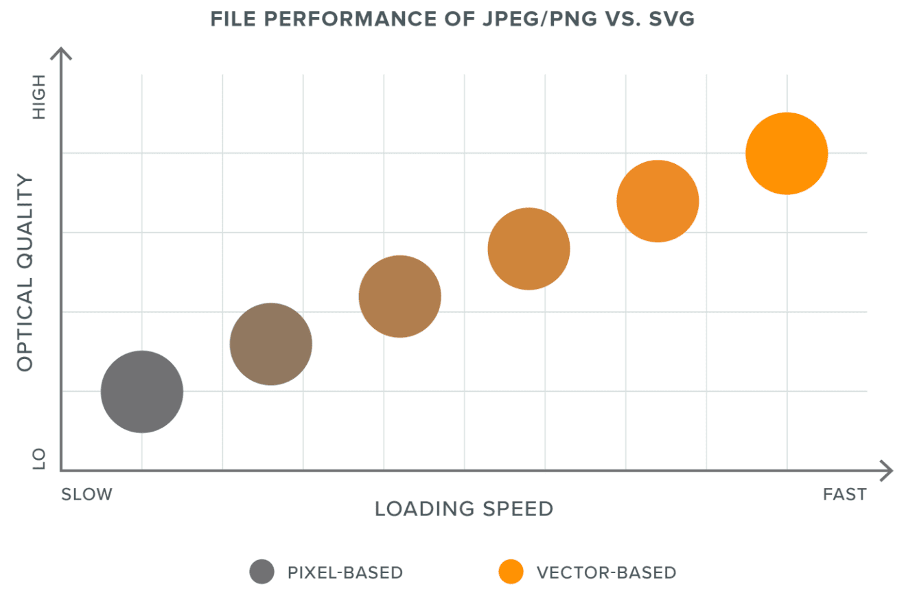
Optimize Page Speed Through Vector Graphics
Mobile graphics are a vital tool for your B2B firms to improve time-on-site metrics and increase customer interest. However, complex animations can lead to bloated image sizes that drag down page load times and render poorly on smaller devices.
Scalable Vector Graphics (SVGs) resolve both issues by allowing animations to be created and stored in smaller file sizes. Not only are SVGs often under a megabyte, but they’re also fully responsive to each user’s platform and scale to any size without sacrificing quality. Using SVGs for smaller files like your site’s icons provides another way to reduce page load times on all devices.
Your website can still use PNGs or JPEGs for static photos and graphics. But each should be optimized through Photoshop or other image editing tools to protect your site performance.
Create a Responsive Navigation Bar
Your site’s navigation requires special care in responsive design. Instead of simply scaling up or down with the page layout, your navigation should be redesigned to suit different devices.
If your desktop’s navigation uses a bar at the top of the page, your navigation on mobile needs to be reduced down to hidden items in an accordion icon. In order to create the best user experience, you also need to consider your highest priorities in the navigation.
Your firm needs to set its priorities for what parts of your site should be closest to the surface on mobile devices. Rather than forcing your users to endlessly scroll through every item on your navigation, you should focus on what’s most important for your users and your business.
Focus on Mobile-Specific Elements
Scannable content is crucial for a successful B2B website. When your site occupies the limited real estate of a mobile device, your demand to create a clear visual hierarchy with your content becomes that much stronger.
Simplifying your site’s overall layout provides a way for your firm to set priorities for users on mobile devices. If a high-profile testimonial or recent award is valuable for your audience’s decision-making, you need to ensure this information is readily visible and scannable.
Simplifying your site’s overall layout provides a way for your firm to set priorities for users on mobile devices.
As needed, you should also edit your mobile site’s content to prevent long blocks of text or irregular line breaks. Just as importantly, you also need to ensure that active, clickable text retains usable touch target points so users can click where they want to go.
Brand Consistency is Key for a Successful B2B Website
Regardless of what changes your responsive design needs, your site should remain visually and functionally consistent across every device. From phone to tablet to high-definition monitor, your firm’s site should emphasize a clear connection with your brand.
By offering an equitable experience for users regardless of their device, you build an early connection by underscoring that your firm is accessible and available — wherever your users are.
From web design, CMS websites, applications, ecommerce, motion graphics and multimedia, graphic design, and print, to Internet marketing solutions, we’ve got you covered.
Get our latest news, insights, and project spotlights delivered directly to your inbox.
* We are the sole owners of the information collected on this site. We only have access to/collect information that you voluntarily give us via email or other direct contact from you. We will not sell or rent this information to anyone.


