Today’s B2B businesses depend on their websites to nurture and deliver new customers. It doesn’t matter if your design creates a flawless customer support experience, tells a compelling story about your brand, or ranks at the top of search results pages. If your site isn’t connecting prospects with your sales team, then your site effectively functions as a dead end.
Lead generation depends on landing pages that are designed to generate conversions. A successful landing page includes a number of basic ingredients that culminate with a compelling call to action. However, once your firm finds a layout that is effective, you can’t assume it can be deployed across your site. Landing pages — and your prospects — just aren’t that simple.
Fundamentally, landing pages mark an end point in your customer journey. But to ensure that ending properly serves your business, it requires more care than a one-size-fits-all approach.
Related Asset
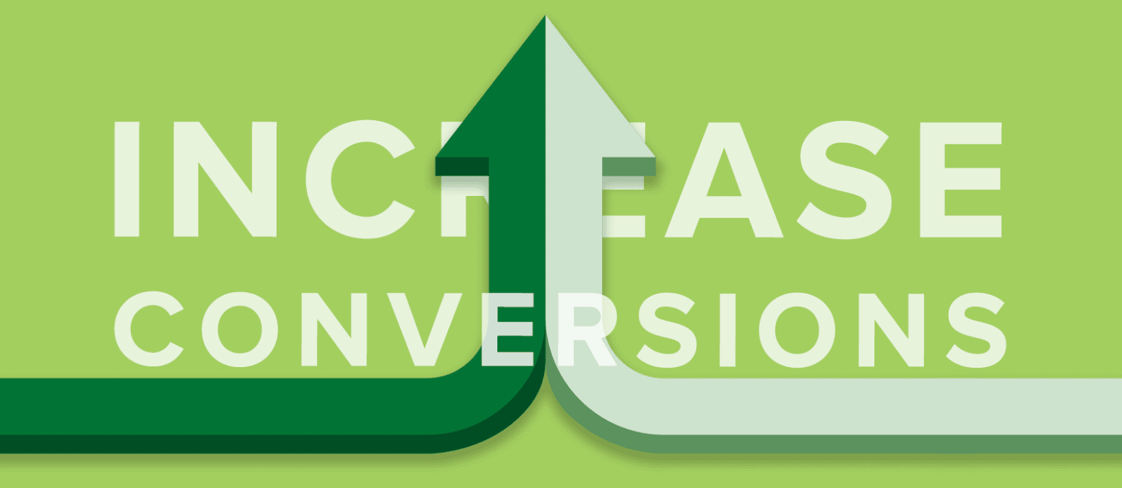
Key Ingredients of Successful Landing Pages for Every B2B Website
Any landing page should create a narrative for prospects that encourages a conversion. From the beginning, your users should view your page design and easily identify all the details they need to contact your firm, including the pain point they need to resolve and why your business is the right choice to help.
Strong landing pages establish an emotional connection with users. After all, your prospects aren’t simply representations of the brands who align with your firm’s target customer. They’re regular people who have a problem they need to solve. The more your firm can connect with customers on this person-to-person level, the better your conversion rates will be.
An effective landing page follows these 6 principles:
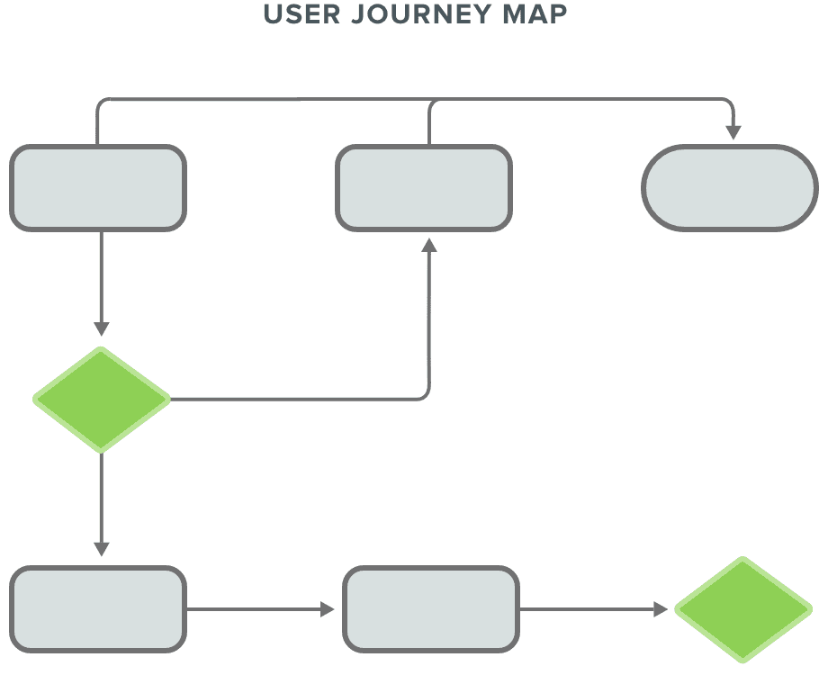
1. Remember the User Journey
You should keep in mind that your customer’s experience with your brand started before arriving at your landing page. Whether someone has clicked on an email link, banner ad, or elsewhere on your website, they started their journey from a different source.
Consequently, the biggest mistake your B2B firm could make is expecting your landing page to serve every user experience. Ideally, every landing page should be customized to reflect your user’s needs and the messaging that brought them to that point.
If your LinkedIn ad referenced a specific pain point, your landing page should reflect that message. Similarly, if your prospect comes to the page from your site, they won’t require as much information about your brand as landing pages targeting users arriving from elsewhere.
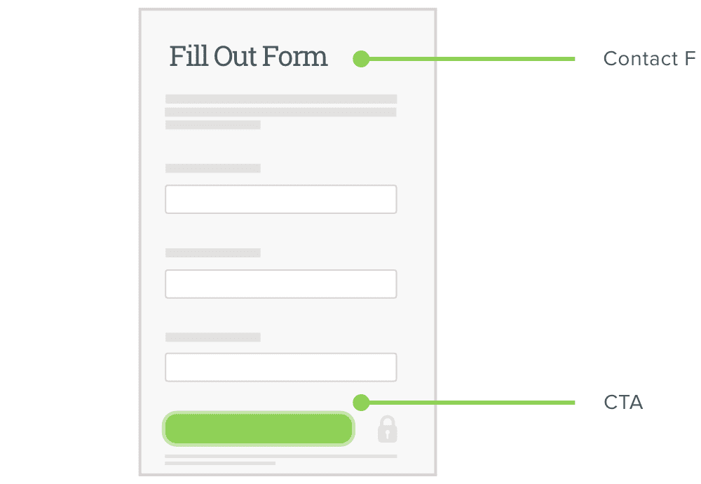
2. Create a Simple Contact Form and CTA
Designing an effective form and CTA is a balancing act. If your form includes too many fields, your prospect may feel daunted by the perceived time investment required. But if it’s too short, your sales team may not have enough information to understand if the prospect is the right fit.
Most importantly, the design of your form should be simple and straightforward. Single-column layouts are easiest for users to follow, and each required field should be marked with visual indicators and form titles that prompt users for input. Actionable titles like “Fill out this form now”” and eye-catching CTAs such as “Get Started,” “Try Now,” and “Request Demo” are more compelling for users than something generic like “Submit.”
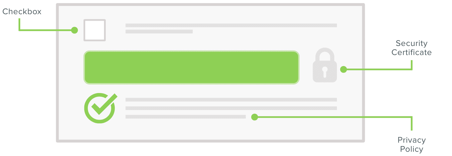
3. Offer Reassurance About Security
Your firm is asking for something valuable when you request a prospect’s information. At the end of your form, you should include your privacy policy, security certificates, and be transparent about how their personal data will be used.
If submitting a form will add users to your newsletter distribution list, you should add a checkbox that offers the choice to opt in or out. Being honest and upfront about what a form submission means for users builds trust for whatever happens after a prospect converts.
4. Present Clear, Scannable Content
Every landing page should deliver a crisp, clear message of your firm’s value proposition. From your header image and text to scannable bullet points that underscore the benefits of your services, landing page content should be clear and easy to digest quickly.
If your landing page offers visual content such as a data sheet or video demo as a gated asset, you should offer a preview of what your firm is offering. A 30-second teaser clip or sample image(s) of what your prospect will access after completing the form will build interest for users.
5. Provide Social Proof from a Meaningful Source
Your landing page form should assure prospects of the value of your services from independent sources. Customer testimonials, awards, and any relevant certifications offers social proof that your customers will have a positive experience working with your firm.
For example, if your cloud services are FedRAMP approved, you should present those qualifications clearly on the page. A well-designed landing page will address any lingering questions your prospect may have before they convert.
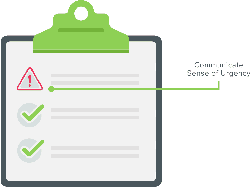
6. Leverage FOMO for Your Firm’s Advantage
Given that form completion rates typically fall below 5%, your firm should take every step to ensure each landing page visit is successful for your business. For any consumer, the fear of missing out can be a powerful motivator to drive action.
Your landing page copy should communicate a sense of urgency to your prospects. You can express that a free trial of your services is only available for a limited time, or you can reaffirm the urgent need of addressing your prospect’s concerns.
For example, if your firm specializes in data security, your landing page could say, “Don’t allow your data to be at risk any longer. Contact us and we’ll show you how.”
Following Landing Page Best Practices Delivers Conversions for B2B Firms
Any B2B firm would love to find a landing page design that captures the right combination of visuals and content to deliver a 100% completion rate. But that’s simply not realistic.
Any landing page should create a narrative for prospects that encourages
a conversion.
However, incorporating a design approach that leads to even a 1% improvement makes a big difference for your firm’s bottom line. Allowing your CTA to follow users as they scroll down the page or navigate users directly to your contact form are a few steps that can generate results. Or, for a more subtle approach, you can incorporate a form that’s hidden on the page until your prospect clicks a link to “view demo” or whatever gated asset that’s right for your firm.
While no one design will convert every prospect, you can optimize your results by ensuring your landing pages remain specific to your campaigns. If this sounds like an approach to lead generation that will make a difference for your firm, we should get started.
From web design, CMS websites, applications, ecommerce, motion graphics and multimedia, graphic design, and print, to Internet marketing solutions, we’ve got you covered.
Get our latest news, insights, and project spotlights delivered directly to your inbox.
* We are the sole owners of the information collected on this site. We only have access to/collect information that you voluntarily give us via email or other direct contact from you. We will not sell or rent this information to anyone.