To stay competitive, your B2B needs to consistently deliver a clear impression of what separates your organization apart. The quality of your company’s offerings and your website’s ability to demonstrate how it helps prospects are crucial. But in looking for ways to set your website apart, you need to focus on your user experience.
A homepage that features a thoughtful UX design makes a positive impact on critical engagement metrics such as bounce rates, time on site totals, and conversions. Whether your business is a long-time presence in the marketplace or a startup, offering a seamless, modern user experience communicates that you understand your customer. You need to ensure your homepage UX consistently performs at a high level.
Monitoring trends in UX design for B2B homepages doesn’t just offer an intriguing look at evolving best practices to increase engagement. It’s just smart business sense.
How Strong UX Design Benefits B2B Homepages
“User experience” simply refers to how users engage with your website. The goal of UX design is to create a narrative for your home page with clear user flows from one page to the next. It also streamlines the ability of site visitors to find what they need in an efficient and pleasant way. For example, if you’re creating an online banking app, the UX design allows your team to ensure customers can manage their money effectively.
The UX design process creates a positive experience by anticipating every user’s needs in a way that builds trust in your brand and improves conversion rates. UX design also supports SEO by accounting for mobile responsiveness and reducing page load times. Plus, the quality of the design is a key indicator of some of the most successful homepages in the industry.
While these are important factors across your digital presence, your homepage needs to set the standard. A homepage with an optimized UX design nurtures your customer connection and allows the rest of your site to function at its best. Here are 5 UX trends for B2B homepages that are worth watching in the marketplace:
1. The End of Homepage Carousels for B2Bs
Typically navigated by clicking an arrow or multiple dots, carousels have long enabled B2B websites to offer more information without sacrificing space. Unfortunately, the content that carousels hide behind that next click is effectively invisible.
Carousels require an extra interaction from your users — who prefer scrolling. They can be useful in other applications such as product pages requiring a lot of detailed content. But your most important content should always be visible to your most important audience: Current and prospective customers.
For example, Intuit’s homepage breaks apart a carousel into blocks of scrollable content. Similarly, IBM also encourages a scroll while also reworking the norms of a carousel lower on the page. Instead of burying information on the next slide, users can see distinct headings that guide them toward additional content.
2. Navigation Should Always Be Accessible to Users
Placing all the critical topics for your B2B company along the top of the page ensures the most important areas of your site remain in focus for users. However, as you scroll, the navigation often disappears. Worse yet, if your business has a broad range of offerings, you face limited real estate to express vital details of your brand.
A left navigation allows Databricks to keep all its core details visible as users scroll down the page. For especially large companies like Salesforce, a combination of both worlds allows broad top navigation items to populate a full menu of possibilities from the left.
The flexibility of left navigation has also made it more appealing for websites that respond to screen sizes, such as tablet and mobile users. Desktop sites are now exploiting these advantages as well.
Navigation menus that remain in place (or “sticky”) as users scroll provides another way to ensure users retain access to other sections of your site. For long homepages, such as Slack or Zendesk, sticky navigation enables users to retain access to vital details such as products and pricing even as they gather more information about the company.
3. Shifting the Content Focus in B2B Website Footers
B2B companies long used the site footer as a sitemap for users who scroll to the bottom. However, as SEO best practices have evolved, this approach has damaged the link equity for your company’s homepage. In other words, if you say every page on your site is important, then ultimately none of them are.
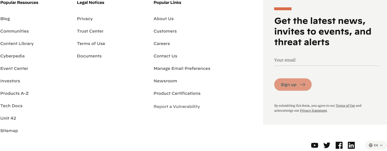
As an alternative, B2Bs have been using footers to drive users to high-traffic pages that have already proven popular in their analytics data. Apart from legal notices, Palo Alto Networks applies its footer to promote “Popular Resources” and “Popular Links” so its most useful content rises to the surface.
Texas Instruments uses its footer to link to “quick link” pages such as design support forums, packaging, and customer support. Expanding your thinking around what content appears in your footers allows you to be more strategic about how you use every part of your homepage.
4. Supporting Stats and Data Demonstrate Value Beyond Testimonials
Whatever offerings your B2B company provides, your prospects want assurances that you’re able to help their business. Customer testimonials have long provided a way for companies to demonstrate the value of services. But hard data offers equally persuasive proof.
Numbers don’t lie, and testimonials are subjective. Depending on your prospect’s business, they may not always see themselves in the experience of a testimonial’s experience. Rather than hiding numerical proof of performance gains or other benefits on product pages, B2Bs are bringing facts to the surface on their homepages.
Pure Storage features data about energy consumption and Net Promoter Score just above its customer stories. After highlighting high-profile customers, ZoomInfo underscores its productivity gains alongside a testimonial.
5. Break Contact Forms into Multiple Pages to Encourage Conversions
UX design is built upon reducing barriers between your site and its users. When your company depends on form completions for lead generation and ultimately sales, you want to deliver a focused experience regardless of how much information you need.
Consequently, more B2B companies have been using stepped forms that appear more digestible to users than long, multifield forms. The demo request form for Khoros appears as a single field offering the promise of only three steps to completion. Similarly, Gantt breaks its form into two distinct steps to further compel users to provide their data.
Optimize Your Entire B2B Website to Deliver Superior UX
Whatever goals your B2B website needs to deliver, a strong UX design brings them closer to fruition. These approaches are just a few ways to ensure your site continues to function at a high level. And while your homepage serves as your site’s front door and first impression, there are plenty of other trends and emerging best practices you can incorporate throughout your site.
Read More: 5 B2B Website Design Trends to Watch in 2023
If your homepage and the rest of your site could use a fresh start, contact us to learn how Clear Digital can help you achieve your goals.
Get our latest insights in your inbox

What Makes a B2B Website Actually Effective in 2026
By Clear Digital on June 18, 2026
Read more
Why Brand Messaging and Website Strategy Have to Be Built Together
By Clear Digital on June 18, 2026
Read more
When Your In-House Team Needs External Web Support (And How to Know)
By Clear Digital on June 4, 2026
Read more