Most B2B SaaS websites do not have a traffic problem. They have a conversion problem. The site may be ranking, paid campaigns may be running, and prospects may be landing on key pages, but too few of those visitors are becoming demo requests, trials, or qualified conversations.
That gap is expensive. According to recent B2B SaaS benchmarks, average visitor-to-lead conversion sits around 1.5% to 2.5%, while top performers reach 8% to 15% by tightening user flows, sharpening messaging, increasing proof, and removing friction from key actions.
The best SaaS websites do more than explain the product. They help buyers understand value quickly, compare options with confidence, and take the next step without unnecessary effort. Below are five practical conversion principles, with real examples from SaaS companies that put them to work.
Planning a SaaS website refresh?
See how we approach SaaS web design, UX, and branding.
Why SaaS Website Conversion Breaks Down
SaaS buyers rarely convert because one page “convinced” them. They convert when the website removes enough uncertainty to make the next step feel useful, relevant, and low-risk.
For most SaaS teams, the weak points are predictable: vague product messaging, generic CTAs, buried proof, too many form fields, and conversion paths that treat every visitor the same. A technical evaluator, a marketing leader, and a CFO do not need the same information before they act.
That is why conversion strategy has to connect messaging, UX, proof, and funnel design. Better CTAs matter, but only when the surrounding experience gives buyers a reason to click.
SaaS Website Conversion Tactics at a Glance
Before we break down each example, here is the short version: strong SaaS conversion strategy is not about one tactic. It is about matching the right action to the right buyer moment.
| Tactic | What it does | Company example | Why it works |
|---|---|---|---|
| Dual CTAs | Gives buyers different next steps based on readiness | HubSpot | Supports both self-serve exploration and sales-led evaluation |
| ROI calculator | Shows value before the sales conversation | HubSpot | Turns abstract product claims into personalized business impact |
| Conversational routing | Helps visitors find the right next step faster | Slack | Reduces uncertainty and routes higher-intent visitors more efficiently |
| Educational resources | Captures mid-funnel demand with a useful value exchange | Asana | Builds trust with buyers who are not ready for a demo yet |
| Motion and visual storytelling | Explains product complexity without overloading the page with copy | Stripe | Keeps attention while making complex workflows easier to understand |
| Streamlined trial flow | Reduces commitment at the point of action | Intercom | Makes starting feel lower-risk and easier to complete |
1. Show value before the sales conversation
High-converting SaaS websites do not ask buyers to take the company’s word for it. They help visitors quantify the potential upside before a sales conversation ever happens.
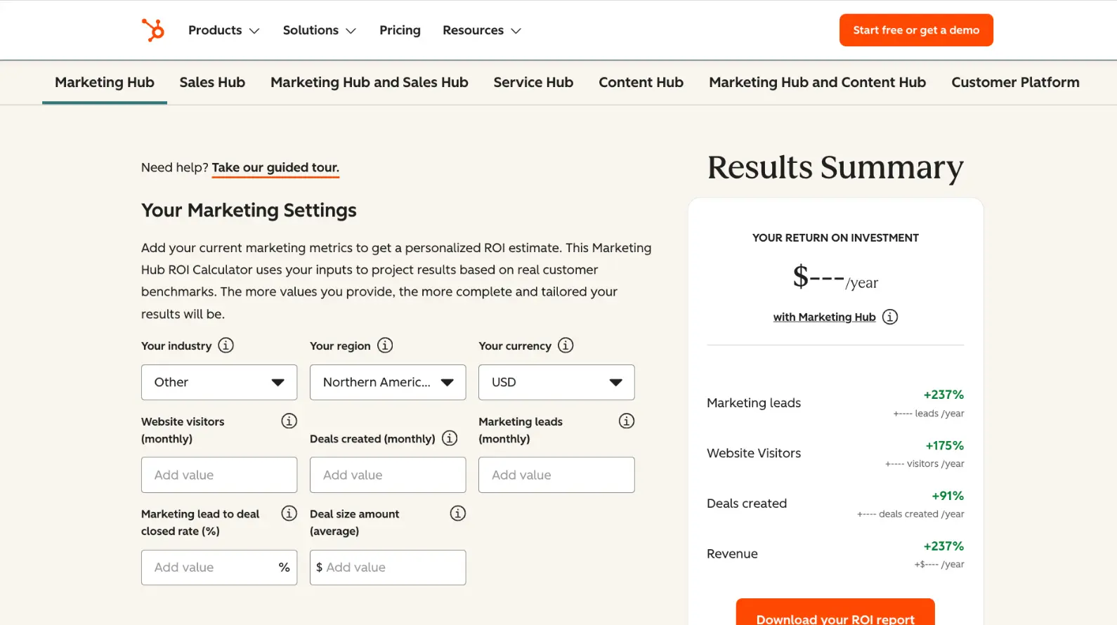
HubSpot does this well with its ROI calculator. The tool lets visitors choose a HubSpot product, add business inputs, and estimate potential outcomes using aggregated customer data. HubSpot currently frames the calculator around products including Marketing Hub, Sales Hub, Service Hub, Content Hub, and Customer Platform, then asks for inputs such as website visitors, leads, deal rate, and deal size to create a personalized ROI estimate.
The lesson is not “add a calculator because HubSpot has one.” The lesson is to give skeptical buyers a way to see value in their own terms. For SaaS websites, that might mean an ROI calculator, pricing estimator, savings model, assessment tool, or benchmark report.
What this looks like in practice: If your SaaS product has a measurable impact on time saved, revenue created, cost reduced, or risk avoided, build that proof into the website experience. Do not make buyers wait for a sales deck to understand the business case.
2. Route visitors based on intent
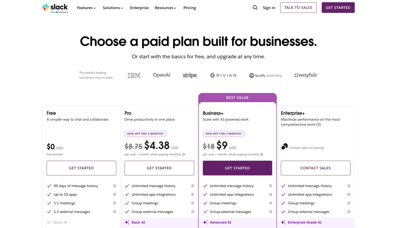
SaaS websites often serve several buyer types at once: end users, admins, department leaders, IT, procurement, and executives. A single “Contact us” path is rarely enough for that range of intent.
Slack’s site has historically used a combination of clear CTAs, sales paths, and guided engagement to help visitors move toward the right next step. The important pattern is conversational routing, not a specific chatbot UI. A strong SaaS site should help buyers self-select where they are in the journey, whether they want to try the product, talk to sales, explore use cases, or understand enterprise fit.
This is especially important for sales-led or hybrid SaaS models. When a visitor is high-intent, the website should not make them dig through navigation or guess which form to complete.
What this looks like in practice: Use CTA paths that reflect real buyer intent. “Start free,” “Book a demo,” “Compare plans,” “Explore use cases,” and “Talk to sales” each serve a different moment. The cleaner the routing, the less friction between interest and action.
3. Use visual storytelling to reduce cognitive load
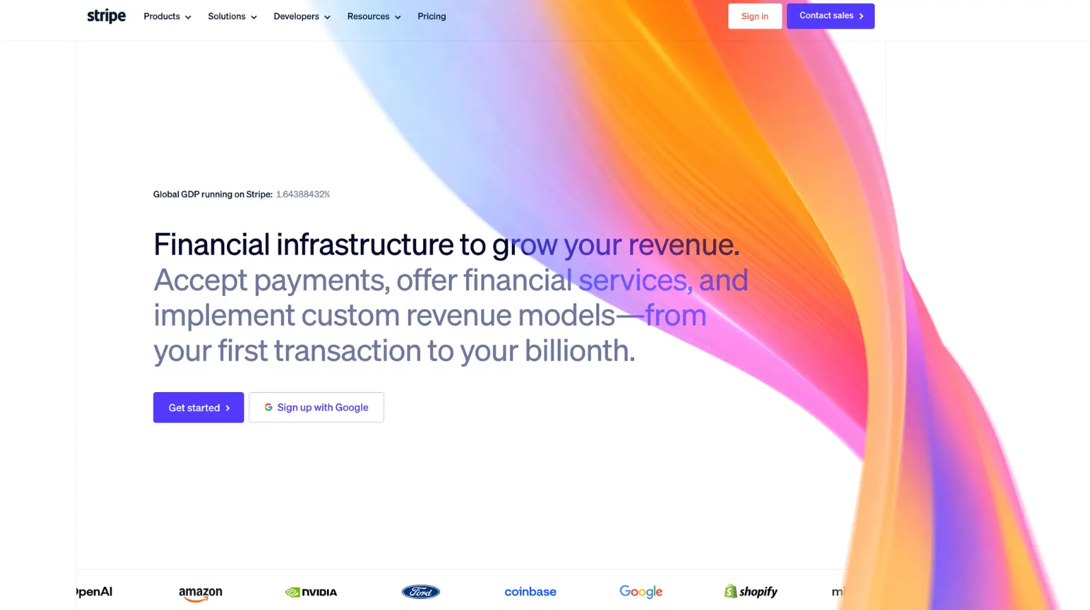
SaaS products can be hard to explain, especially when they involve technical workflows, integrations, payments, automation, or multiple user roles. Long blocks of copy usually make that problem worse.
Stripe’s product pages use visual systems, interface examples, and motion-led storytelling to make complex payment infrastructure feel easier to understand. Instead of relying only on dense feature explanations, the experience gives buyers a faster way to grasp how the product works and where it fits.
That matters because conversion depends on comprehension. If visitors cannot understand the product quickly, they are less likely to keep exploring, share the page internally, or take the next step.
What this looks like in practice: Use motion, diagrams, UI previews, and product visuals when they make the message clearer. The goal is not decoration. The goal is to explain complexity faster than copy can on its own.
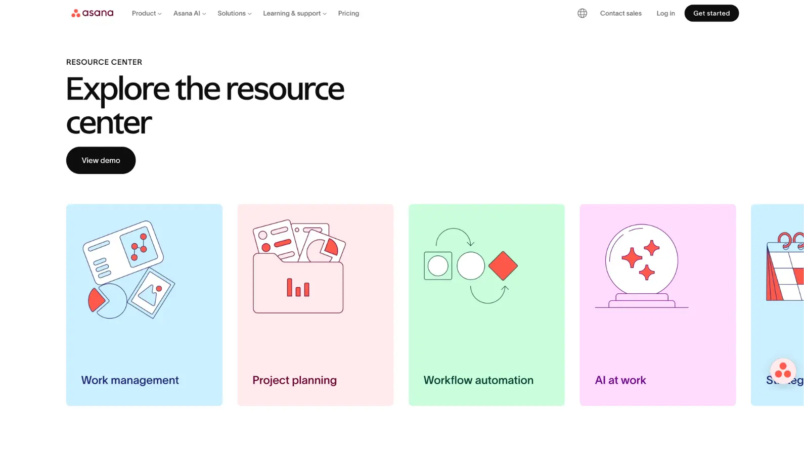
4. Capture mid-funnel demand with useful education
Not every SaaS visitor is ready to book a demo. Many are still defining the problem, comparing approaches, or trying to build internal alignment. A conversion strategy that only serves demo-ready buyers leaves that mid-funnel demand untouched.
Asana supports this stage with practical resources such as templates, guides, and educational content that help visitors improve how they work before they commit to a product conversation. That type of content works because it creates a value exchange. The visitor gets something useful, and the company earns a reason to continue the relationship.
The key is restraint. Gated content can support SaaS lead generation, but it should not interrupt the article before the reader gets value. Use gates when the asset is strong enough to justify the ask.
What this looks like in practice: Offer templates, checklists, benchmark reports, calculators, or guides that help buyers make progress. Then use those assets to segment intent and follow up with a relevant next step.
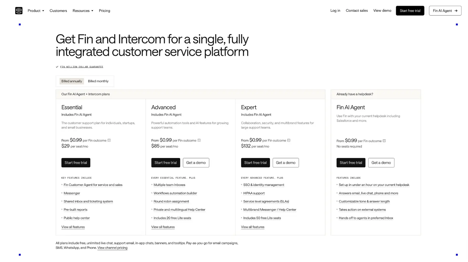
5. Remove the small frictions that stop action
Conversion friction is not always dramatic. Sometimes it is one extra field, unclear pricing, a hidden next step, or a trial that feels like a commitment before the buyer is ready.
Intercom gives visitors a lower-friction path with a 14-day free trial and messaging that confirms no credit card is required. Its current pricing page also offers clear “Start free trial,” “View demo,” and “Contact sales” paths for different levels of readiness.
That combination matters. The page reduces risk, gives buyers options, and makes the next step feel manageable. For SaaS companies, this kind of friction reduction can be the difference between a visitor who hesitates and a visitor who starts.
What this looks like in practice: Audit every conversion point for unnecessary effort. Ask whether the form needs every field, whether the CTA sets the right expectation, and whether the buyer knows what happens after they click.
What High-Converting SaaS Websites Have in Common
The strongest SaaS websites are not built around one conversion trick. They create a clearer path from interest to action.
Across these examples, three patterns show up again and again. First, they reduce friction at the moment of conversion. Second, they make value easier to understand before a sales conversation. Third, they use proof, education, and interaction to help buyers move at their own pace.
We see the same patterns in our own SaaS work. Viral Nation’s brand and website refresh increased conversions by 104% by aligning the experience around clearer positioning, stronger proof, and better buyer pathways. Clear Digital’s Habu work delivered stronger engagement through a modular, scalable website that supported Habu’s growth story, improved lead conversions, and contributed to stronger market positioning ahead of its $200M acquisition.
For SaaS teams, the takeaway is simple: conversion improves when the website does less explaining and more guiding.
B2B SaaS Website Conversion FAQs
What is a good conversion rate for a B2B SaaS website?
Most B2B SaaS websites convert roughly 1.5% to 2.5% of visitors into leads, while top performers reach 8% to 15% depending on audience, channel, offer, and funnel stage. If your site is generating traffic but very few demo requests, the issue is likely not just traffic quality. It may be weak messaging, poor CTA clarity, limited proof, or too much friction in the conversion path.
How do SaaS companies reduce friction in their demo request flow?
SaaS companies reduce demo friction by keeping forms short, making the CTA specific, explaining what happens after submission, and offering alternate paths for visitors who are not ready to talk to sales. The best demo flows also qualify intent without making the buyer do unnecessary work. Every required field should earn its place.
What role does social proof play in B2B SaaS conversion?
Social proof helps buyers reduce perceived risk. SaaS buyers are often comparing several vendors, so case studies, customer logos, quantified outcomes, testimonials, analyst recognition, and integration proof all help validate the decision. The most effective proof appears close to the point of action, not buried on a separate page.
Should B2B SaaS websites use gated content for lead generation?
Yes, but only when the value exchange is strong. Gated reports, calculators, templates, and benchmarks can work well for mid-funnel buyers who are not ready for a demo. The mistake is placing a gate too early or asking for too much information before the reader has received enough value.
How does UX design affect conversion rates on SaaS websites?
UX affects conversion by shaping how quickly buyers understand the product, find relevant proof, compare options, and take action. Strong SaaS UX reduces confusion across complex journeys, especially when multiple personas are involved. Better navigation, clearer page hierarchy, stronger CTA placement, and simpler forms can all increase qualified actions.
What is the difference between lead generation and conversion optimization for SaaS?
Lead generation focuses on capturing interest. Conversion optimization focuses on improving the percentage and quality of visitors who take a meaningful action, such as requesting a demo, starting a trial, using a calculator, or downloading a high-intent resource. For SaaS companies, the strongest websites do both: they attract the right visitors and make the next step clear.
Turn SaaS Website Traffic Into Qualified Action
A high-performing SaaS website does not just describe the product. It helps buyers understand the value, trust the company, compare the path forward, and take action with less hesitation.
That takes more than adding another CTA. It requires sharper messaging, clearer UX, stronger proof, and conversion paths built around how SaaS buyers actually evaluate solutions.
If your SaaS site is generating traffic but not enough demos, that is a solvable problem. Clear Digital helps SaaS teams turn complex products into digital experiences that drive measurable growth.
Let’s Talk | See our SaaS work
Get our latest insights in your inbox
When Your In-House Team Needs External Web Support (And How to Know)
By Clear Digital on June 4, 2026
Read more
What B2B Buyers Now Expect From an AI-Era Agency Partner
By Clear Digital on June 4, 2026
Read more
The Future of Web Design with AI: What B2B Companies Need to Know
By Valod Amirkhanian on March 31, 2026
Read more