For prospective higher education students and their families, the first stop when looking at a potential school is its website. In fact, for many this has become the primary campus visit—which makes websites a crucial frontline tool in higher education marketing, enrollment, and brand building. Despite this fact, many higher ed institute websites still feel flat and outdated, making it harder to engage diverse audiences.
With demographics shifting and student expectations evolving, colleges and universities need to reimagine their digital presence to keep up with demand and deliver the outcomes they desire. Let’s explore the key higher education website design trends that leading schools are using to drive deeper engagement and more conversions.
Why higher education marketing matters more than ever
College recruiters have been aware of a looming “demographic cliff” for a number of years, and fall of 2025 is when it’s expected to start impacting admissions offices. It’s the result of a significant drop in US birth rates following the 2007 recession—a drop we still haven’t fully recovered from. Fewer babies being born 18 years ago means fewer higher learning applicants today, which makes higher education marketing incredibly important.
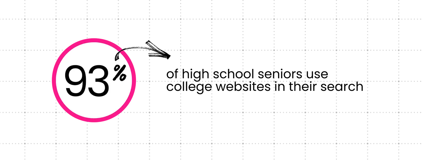
With the pool of prospective students shrinking, colleges and universities are under increasing pressure to drive enrollment. They have to work hard to first attract and then meaningfully engage applicants, and the best place to do that is online. According to leading higher education enrollment solution provider RNL, 93% of high school seniors use college websites in their search, and 88% find these sites helpful. For higher ed marketers looking to stand out from the crowd, start by making sure your website delivers exactly what students are looking for.
Meeting and exceeding student expectations
For prospective students and their families, a college, university, or community college’s website has to make a good first impression. College applicants, especially Gen Zers, expect the same thing from higher ed institutes that they expect from the brands they do business with day to day: seamless, mobile-first, and personalized digital interactions. To meet these expectations, combine strategic UX/UI design with compelling, differentiated messaging and clear, accessible content.
We have found that over 60% of university traffic comes from mobile.
Personalization is expected—not optional
Personalization has become essential in higher education marketing, and dropping a name in an email isn’t enough. You need to go further, designing digital experiences to show the right content to the right users at the right time. Because today’s students expect you to know who they are and what they’re looking for—and show it to them.
An example of a higher education institute that’s getting this right is the University of Wyoming, which pairs academic program information with real-time career and salary data, all in one place. This allows students to instantly see and understand not just what degrees are available, but the real value of those degrees. It’s a smart way to convey what prospective students stand to gain from your institution, and also shows that you understand and care about them.
Build trust with authentic storytelling + student-driven content
Students seeking out the next chapter in their lives want to hear from real people having real experiences—they can spot marketing jargon a mile away. They want to know what it’s like to attend classes, to live in your community, and to be part of your student body. And they want to know what values are important at your school, so they can gauge if it’s a good fit.
Authentic storytelling can differentiate your institution from similar schools by creating real connections that help prospective applicants visualize themselves attending. Use real stories from students, faculty, and researchers to show them what’s unique about your location, your community, and your offerings. Alumni stories are a great way to demonstrate ROI, because they showcase the possibilities that come with a completed degree.
Berklee College does this beautifully, shining the light on student voices to highlight creativity, community, and what it actually feels like to be there.
Drive conversions with UX simplicity + optimization
The majority of web browsing is done on mobile these days, making mobile-first design essential. According to a recent survey, over 60% of university website traffic now comes from mobile devices. Start by making sure your website is responsive, so users get a good experience on any screen, and optimized for mobile.
Usability matters too, so design your site for easy navigation—especially when searching for information about available degrees, classes, and other offerings. If a visitor who’s not super familiar with higher education websites can’t immediately find what they’re looking for, they’re likely to leave.
The best higher ed sites are clean and crisp. Prioritize clear navigation, copy that’s succinct and punchy, and just enough white space to breathe. While it may be tempting to cram a ton of info onto your landing page, overcrowding is overwhelming, and drives visitors away.
Instead, focus on making it easy for visitors to find what they’re looking for. Features such as program finders, step-by-step forms, and virtual tours guide users towards deeper engagement. Eye-catching CTAs like Apply Now or Schedule Your Visit help them take the next step without overthinking it.
Harvard University, with a sleek, modern, and refreshingly simple site, has set a new standard here. Taking cues from forward-thinking brand websites, Harvard breaks away from the cluttered and dated look so many higher education websites still share.
Bringing design expertise and UX strategy to higher education
Clear Digital has partnered with a number of higher education institutions on website builds, redesigns, and other digital marketing experiences, bringing our unique blend of design, UX, and tech expertise to create meaningful connections with their audiences.
We created a simple but standout website for a new Stanford University faculty housing development located just blocks from campus, which allowed faculty to explore the community and view various available home layouts and styles. More recently, we revamped the site belonging to the university’s think tank, the Hoover Institution. Working closely with the organization, we enhanced the visual experience while simplifying the site’s navigation and information architecture. The new site is clean, simple, and impactful.
Other higher ed clients include Brooklyn College, whose site we redesigned to help their spirit shine through, and San Jose State University, where we revamped the student news site.
If you’re a higher education marketer in need of digital differentiation, let’s talk about how our team can help you deliver standout digital experiences that attract prospective students, driving applications and enrollment.
Get our latest insights in your inbox
When Your In-House Team Needs External Web Support (And How to Know)
By Clear Digital on June 4, 2026
Read more
What B2B Buyers Now Expect From an AI-Era Agency Partner
By Clear Digital on June 4, 2026
Read more
The Future of Web Design with AI: What B2B Companies Need to Know
By Valod Amirkhanian on March 31, 2026
Read more